Expandable Table
The Expandable data table is a type of group banded report. Each row presents a distinct value from the grouping field, with special formatting applied to highlight the value. The number of detail records associated with the grouped value is displayed in parentheses adjacent to the grouped values. Expandable tables are especially useful for organizing datasets with a large number of rows, as multiple detail rows are collapsed by default and only revealed when users select each group header row.
Each group used to construct the table is displayed as a collapsible header. You can expand each header row to display the corresponding details that belong to that group.

Create an Expandable Table
You can create an expandable table using either of the drag-and-drop actions:
- Add fields from the data source into the columns section at the top of the window.
- Add fields into the top table guideline with the label Drop column as column when the mouse hovers over the table. The following example shows how many units of each product have been shipped to particular cities and their timestamps. Drag and drop the quantityOrdered and productName columns as Columns, and city and shippedDate as Sections.

Style the Expandable Table
Use the Chart Builder's Configuration panel to style different aspects of your table.
General
The General section is available for all chart types. Options vary depending on the chart type.
-
Freeze First Column - This checkbox is only displayed when using an expandable table:
- ON (default) - Freezes the first column of the table so that when scrolling horizontally, that column remains fixed to the left of the table visualization. The rest of the table visualization scrolls beneath.
- OFF - When scrolling horizontally, all columns and groups scroll together. Screen size can cause some columns to be hidden from view.
-
Max Groups - Limits the number of group header rows displayed. This value is set to 10 by default and cannot be lower than 10. There is no upper limit. If there are no columns in the Section shelf, the Max Groups option does not appear.
-
Records per Group - Limits the number of detail records shown for each expandable group header row. This value is 10 by default and cannot be lower than 10, with no upper limit.
-
Totals - Select +Add Total to display a grand total for a selected column that summarizes the number of records for a group. Select the column to total, then select an aggregation type. For Level, you can display the total for the whole table or a single column. You can also display the total for the complete table.

Self-Service Options
This panel provides options that enable end users to personalize their tables. Customizations made in a dashboard are saved for the end user. In embedded scenarios, the clientId must be provided to save the personalizations.
| Option | Description |
|---|---|
| Filtering | Enables the Filtering option, so that end users can add filters to the chart. For more information, see Filters. |
| Column Resizing | Enables end users to change the width of columns inside the table. |
| Sorting | Enables the Sorting option, so that end users can apply sorting to the table. The Sorting option supports both multi-column and individual column sorting. For more information, see Sorting in Tables. |
| Add/Remove Columns | Enables end users to select which columns to hide or display. |
| Add/Remove Sections | Enables end users to add or remove sections. |
| Download | Enables end users to download the chart or its data in different file formats. By default, all formats are selected. |
Styles
Use the Styles section to control visual elements such as colors and labels. This chart type supports the following specific options.
-
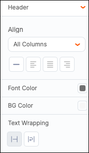
Header - Manage header features such as font, weight, text size, text color, cell color, and borders. You can also control text wrapping within the header row.
-
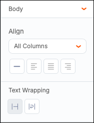
Body - Manage body text alignment and text wrapping.
-
Resize Rows - Set a height for your rows. You can adjust the column width by moving the column borders using the mouse or trackpad.
Format
You can apply conditional formatting to your expandable table. Select +Add Condition, then select the color of the text and the color of the cell to show when your condition is met. You can outline the cell or fill the cell with the selected color. Select a column where the condition should be applied, then set the operator to apply to a specific column or the entire row.
Select Remove to remove the conditional formatting.

You can also include a column that has not been included in the table. In the dropdown menu, you can see chart columns and other columns.
Filters
You can add filters to your table by expanding the Filters section in the configuration panel or by selecting the Filters button in the toolbar.
Resizing Columns
You can manually modify the column sizes of table charts by pausing your cursor over the column's header and dragging the column header to the left or right.

Sorting in Expandable Tables
There are three ways you can sort your columns in expandable tables:
- Select the sort icon in the column pill. Each selection changes the sorting: ascending, descending, unsorted.
- Select a sort option from the three-dot menu in the column pill.
- Directly from the column header in the table.
